
Net worth tracking
Everything you own minus everything you owe, on a line you can actually read. Including the parts of it that are an estimate.
The cash reserve on the home screen answers “what can I spend this fortnight”. Net worth answers the slower question: is this year going better than last one. They are different numbers built from different accounts, and Xfin keeps them apart on purpose.
On this page
What counts
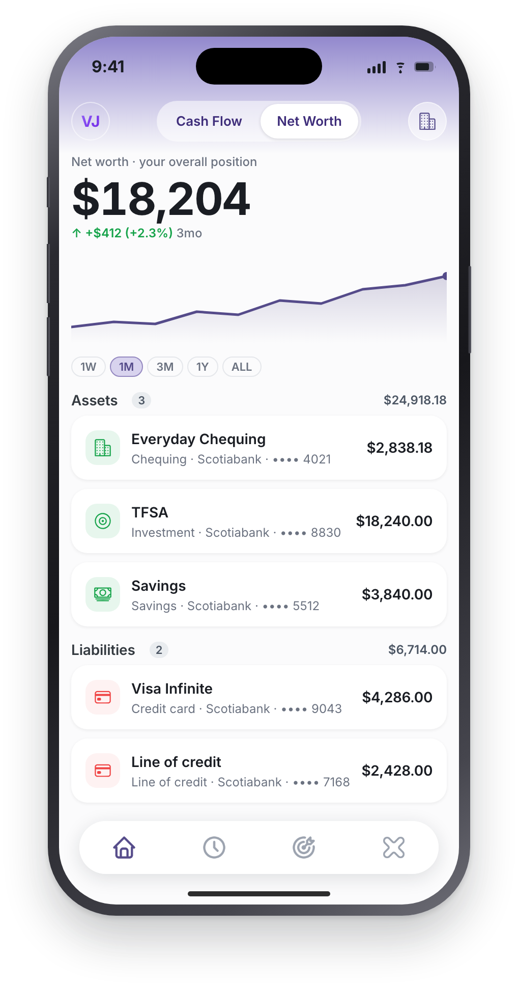
Assets minus liabilities, with nothing excluded for being inconvenient. Chequing, savings and cash. Investment and retirement accounts. A car or a property you have valued yourself. Against them: credit cards, loans, student debt, a mortgage.
Accounts added by hand count exactly like connected ones, which matters here more than anywhere else in the app. The assets that move net worth most are often the ones no bank feed reaches. Running Xfin without a connection.
The chart, and the part of it that is an estimate
You can look at 1 week, 1 month, 3 months, 1 year or the whole history. Over a year the line shows month-end points rather than 365 daily ones, because a year of daily dots reads as noise rather than as a trend. Every point drawn is a real value from the series. Nothing is smoothed or invented to make the shape nicer.
Here is the honest part, and most apps do not tell you this. Xfin records your real total net worth as a daily snapshot going forward. For history before those snapshots existed, the line is reconstructed. Today's balance walked backwards through your transactions. Reconstruction is exact on days you had transactions, and it misses any balance change that had no transaction behind it: re-valuing a car from $20,000 to $18,000, or market movement on an investment account.
So the line is real where there is data and a best estimate where there is not, and it becomes fully real for recent ranges as the snapshots accrue. We would rather say that than let you believe a reconstructed year is measured.
Why a green line can sit over a negative number
If you are digging out of debt, your net worth can be -$35,000 and the chart can be green at the same time. Both are correct: the number is where you are, the colour is which way you are going. It still reads as a bug the first time you see it.
So there is a sentence under the chart that reconciles them. It names the direction and the size of the move, the window it covers, and the “still in the red overall” clarifier, plus what drove the change. It is computed from the exact points the chart drew, so the words can never contradict the colour.
What your debt is costing you a month
Balances tell you where you stand. Interest tells you which way the floor is tilting. Xfin totals the monthly interest across every liability you hold, weighted by each one's rate, so you can see what is pulling your net worth backwards before you have spent a penny.
That number is usually the argument for reordering what you pay first. If you want to put dates on it, the debt payoff calculator runs the same amortisation the app does.
Net worth is not your spending money
A healthy net worth and an empty week are perfectly compatible, which is exactly why the two figures are kept separate:
- The cash reserve counts chequing, cash and savings only, then takes out the bills landing in your window and the money your goals hold. It is what you can decide with.
- Net worth counts everything, including the retirement account you cannot touch and the car you are not selling.
This is also why a goal funded from a brokerage reserves nothing: it moves your net worth, but it was never spendable, so holding it back from a figure it was never in would be double counting. More on how goals hold money.